Withings Home
Designing from scratch
Summary
Forewords
Identifying the key features…
…and the challenges
Navigating recent events
Create visuals that highlights the movements
Showing time, activity and inactivity
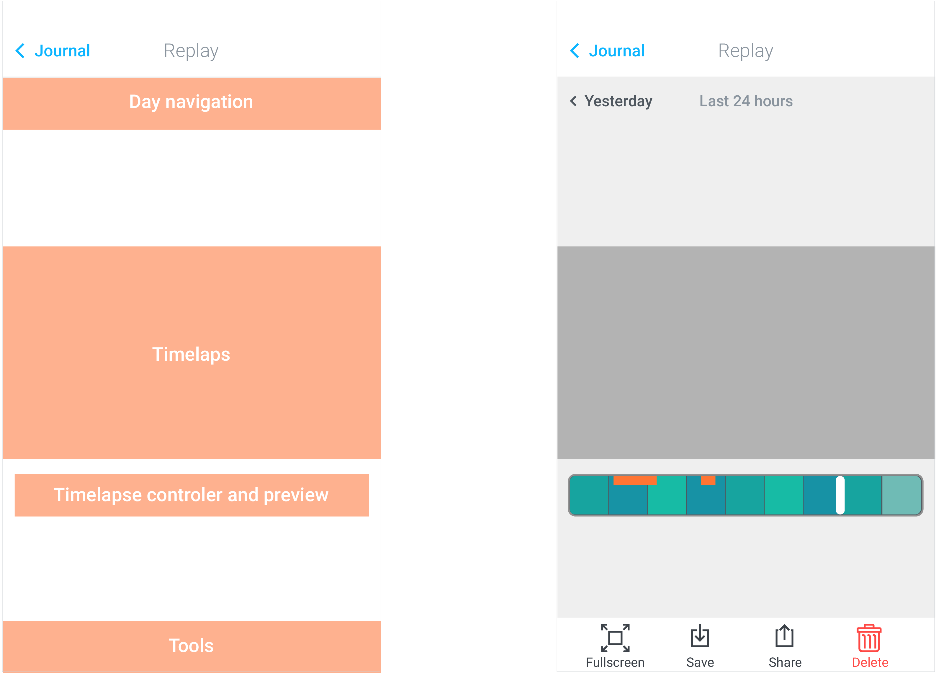
Finalizing the Journal view
Visualizing days in seconds
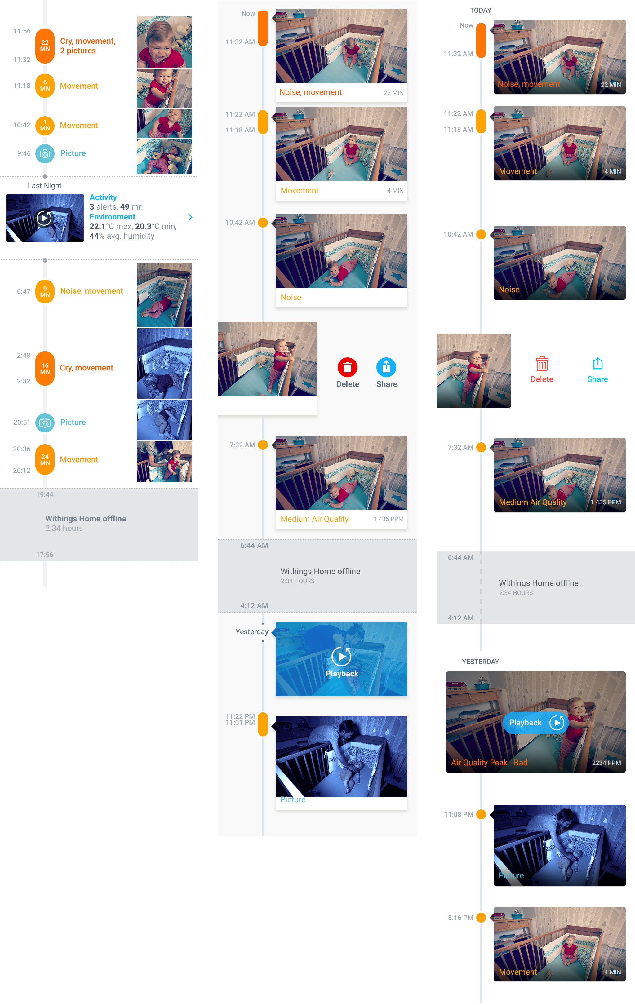
A lightweight view of the whole day
Giving access to hours of video recordings
Live video and interactions
The Baby Monitor's heritage
Polishing micro-interactions
Bringing the pieces together
Navigation between the major screens
A quick look at the app today
Final words
Forewords
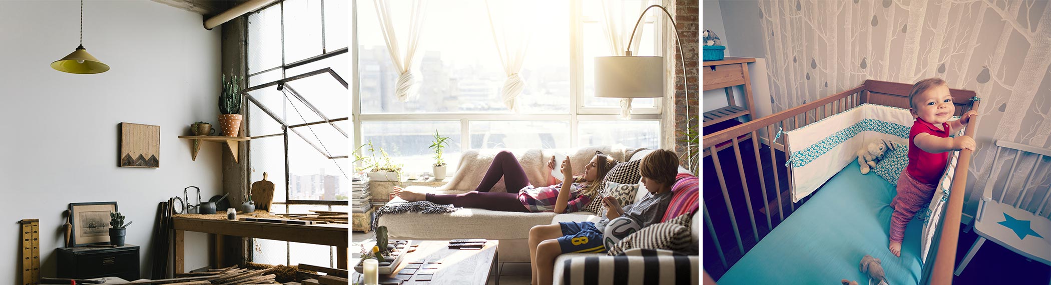
The Withings Home is a Wifi connected camera, a type of object pioneered by Withings a few years back with the Baby Monitor, a device helping parents checking on their baby, from the next room or away at the office, by showing a live video stream and noises and movements alerts.
It was a way to stay connected at a distance by playing music and light animations, and speaking through the device’s speaker.
The new camera would be more versatile, adding family and home features like Air Quality monitoring, events alerting and several days of video recording.
The project started in March 2014, the product launched in November.
Identifying the key features…
We had three area of investigations: home surveillance, family monitoring and baby monitoring.
After running ideation workshops, we identified major use cases and minor ones. Obviously, users would need to be notified of unusual movements and noises, get a quick access to very recent events and ways to browse long periods of time.
For families, use cases like knowing when kids are coming back home and an automatic family journal made out of the emotional pictures and videos.
For baby monitoring, we had a good place to start with the existing Baby Monitor. People would expect a Babyphone mode, rich interaction with their baby, the possibility to catch up with the events of the day, record important events.
… and the challenges
We needed ways to navigate through activities happening live, in the last minutes, or on the course of a few days, give access to tens of hours of video recordings, while keeping rich interactions.
Navigating recent events
One way to provide a quick view on recent events is a timeline displaying events chronologically. It is simple to understand and efficient. Some of our competitors, like Dropcam, used solutions looking this way:
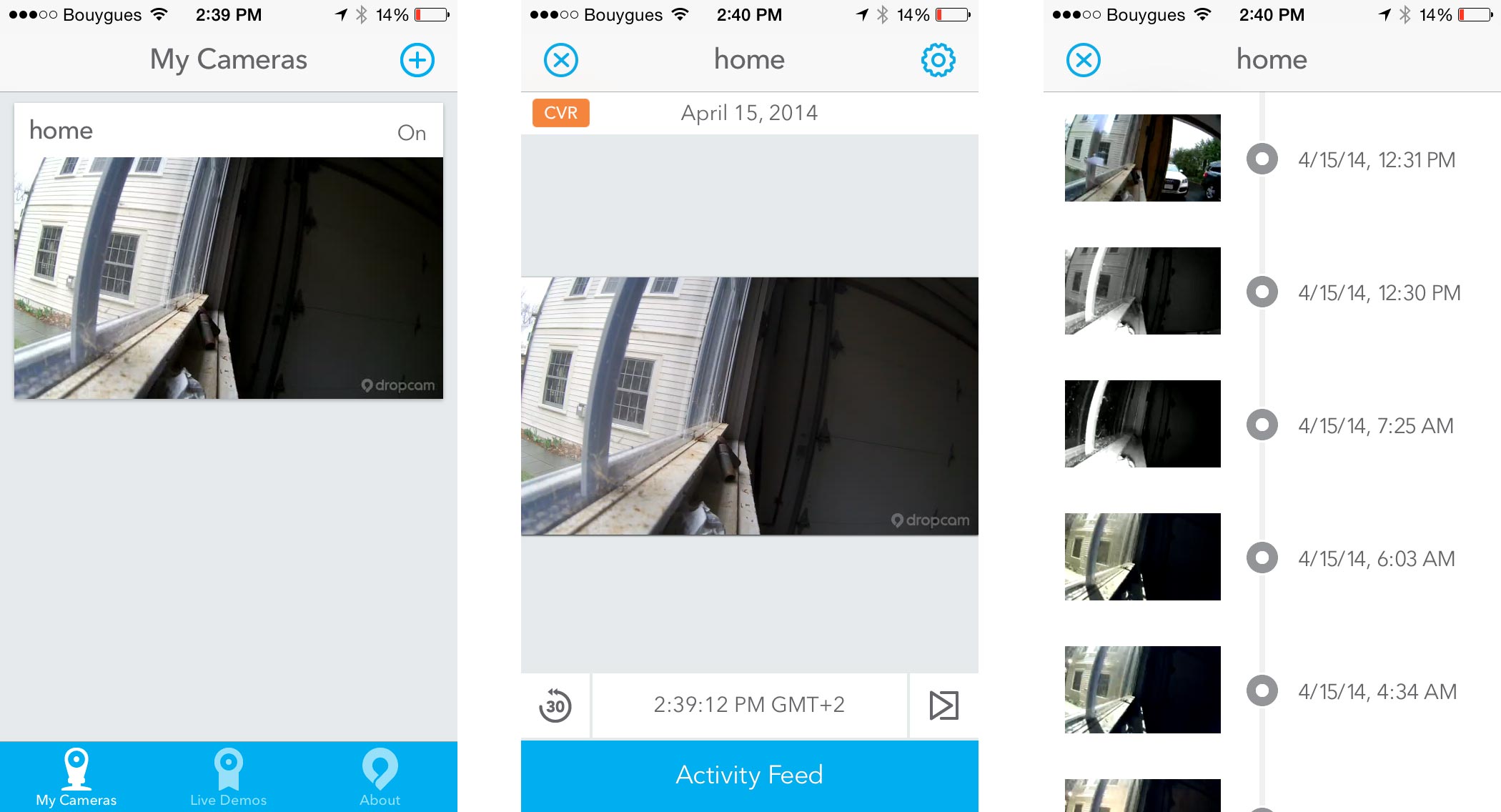
It does a good job at showing recent events.
Yet, images are still, it is difficult to tell what actually happened without loading a video (which takes a few seconds). In a lot of cases, events are false positive, and it is not possible to tell from the timeline view without loading the video.
Also, two events separated by a minute are treated equally with ones separated by 10 hours. Getting an idea of the time difference between events requires reading the timestamps.
The activity feed is relying on video, and only accessible through payed plans.
Create visuals that highlights the movements
I wanted to test two ideas: Instead of showing still images, show image sequences (animated gif like), and instead of showing the complete image, crop the image on the moving part.
A simple motion detection prototype using Processing allowed me to test those ideas.
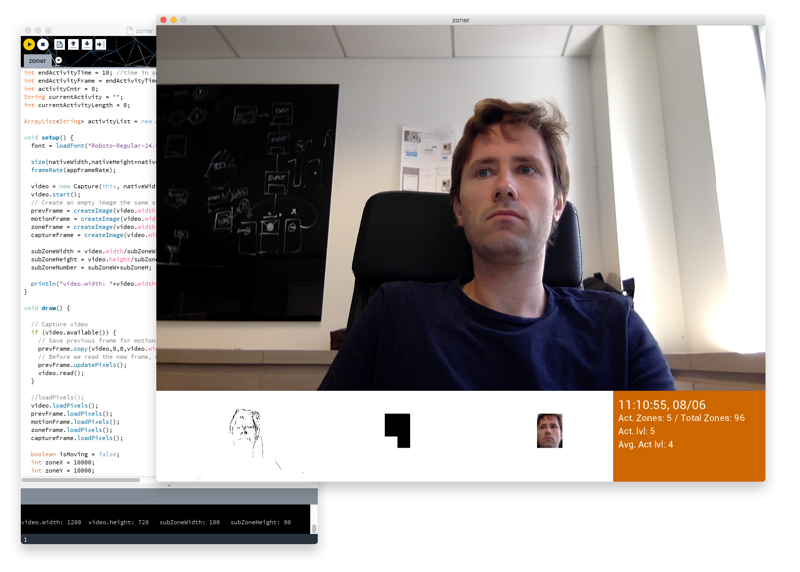
When the camera witnessed an event, it would record a few images, some full frame, some cropped on the movement area.
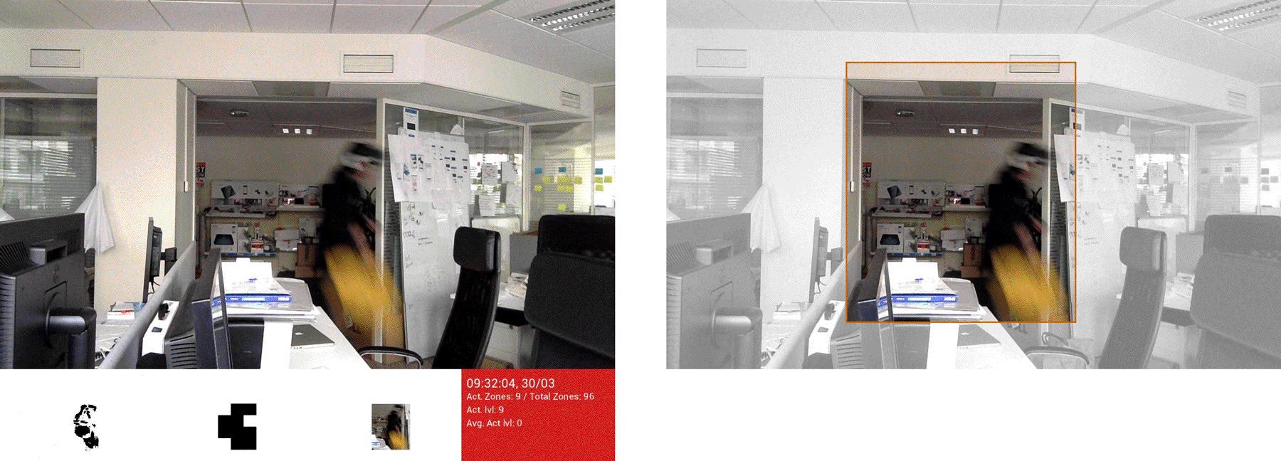
The results showed that:
- 5 images taken over the course of 2 to 3 sec usually conveyed a good preview of the action
- Cropped images were more dynamic (with different image ratios and framing different parts of the image). Beautiful compositions and smiling portrait would sometimes emerge, but were sometimes awkward and show visual deformity (due to the wide lens of the device).
A mix of cropping and animation proved to be difficult to master and too complex to implement on the device, so it was left aside at the time (I still believe it would be worth exploring though).
Showing time, activity and inactivity
A list of events do not create an image of the day. To create something more than just a list, I drew inspiration from a calendar daily view.
A calendar displays items in time, showing activity and inactivity both being important. Also calendars show periods of time, which is slightly smarter than a collection of events.
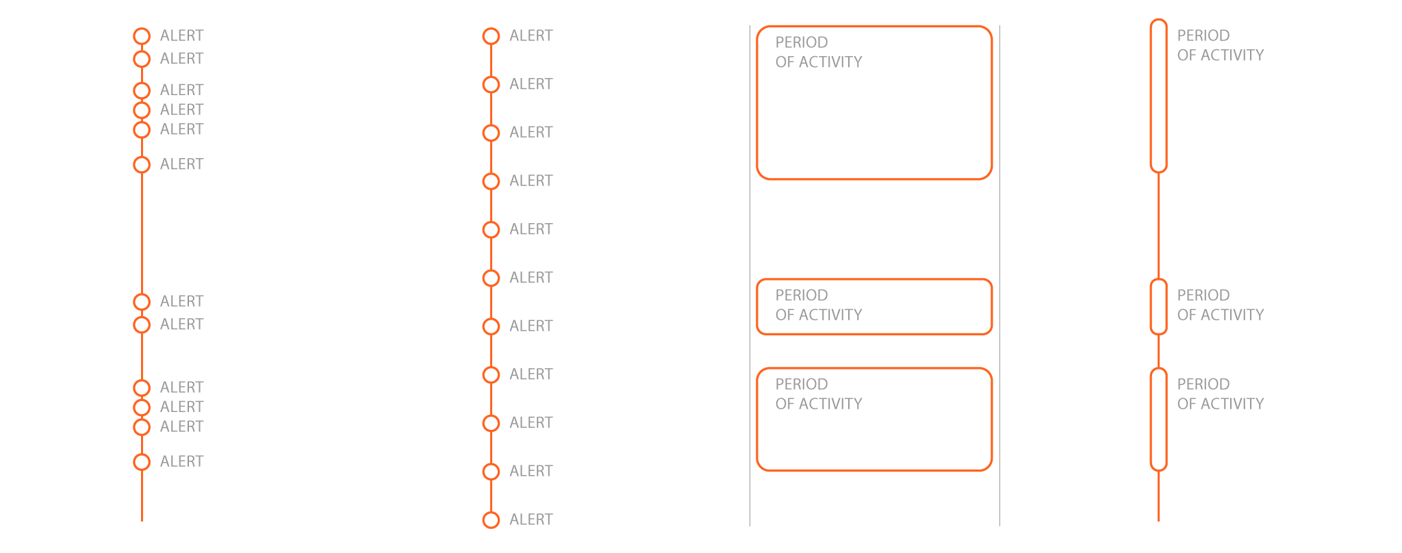
After updating my Processing prototype to have it create periods of activity out of random events and a few iterations, a simple algorithm emerged:
- Alerts would be triggered every time there is movement or noise at a maximum pace of one per minute
- Periods would start every time an alert is triggered, if no ongoing period
- Periods would stop if no alert were triggered in the last 5 minutes
A Period would always have a collection of at least one Alert, would have a start time and a duration. An Alert would have a collection of 5 images and a Timestamp. Alerts would trigger push notifications if no notifications were sent in the last 5 minutes.
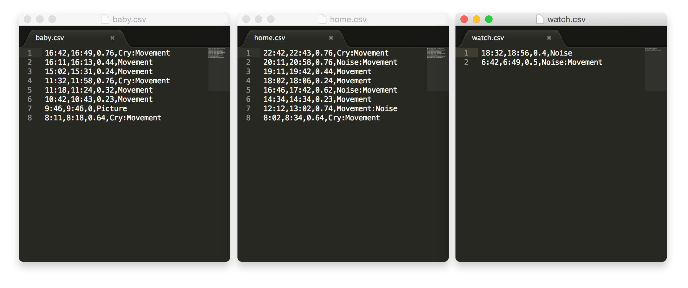
To start experimenting on the visualisations, I created a few fake records of what would be a typical family or baby day as seen by the camera:
and used Processing to work on simple algorithms that would build visualizations from the data:
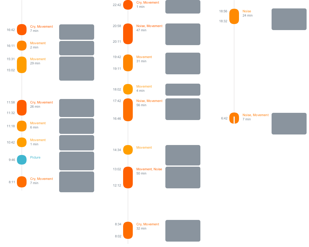
Clearly, trying to represent exact time was a huge constraint for image previews, and would generate large, empty, gaps between events. We needed to find the right balance between exact time representation (calendar), and giving a feeling of time:
After tweaking the algorithm to stretch time, we finally had a solution that would limit empty spaces and still give a good impression of activity as well as inactivity:
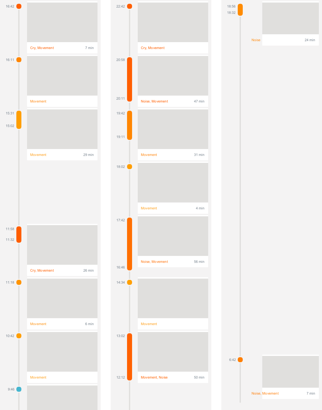
Finalizing the Journal view
We had a basic structure and visual content. There was still a lot to add to the Journal view, like Daily summaries and Camera Offline periods.
The final implemented result looks this way:
Visualizing days in seconds
Working on the Processing prototypes to build the Journal view raised the idea of using the timelapse photographic technique (a technique I used on past projects Timeshifting experiments, VR pictures, Scanning streets) to create a fast and lightweight way to show a whole day in seconds.
A lightweight view of the whole day
In order to highlight important moments, we could have enhanced the classic timelapse (that runs a steady pace) by taking more snapshots when activity was detected.
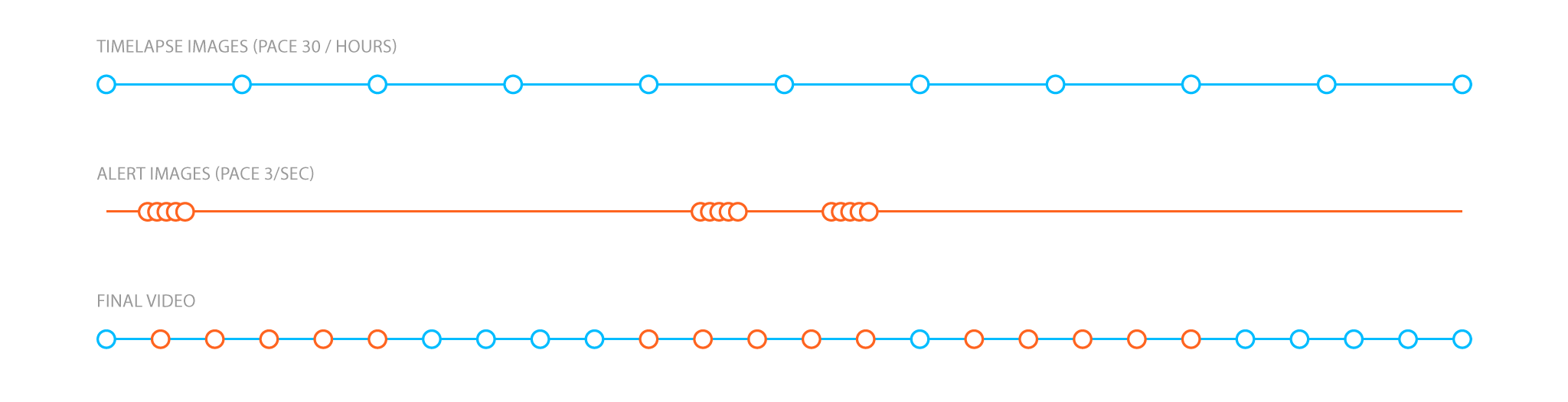
The resulting video would have a variable time pace and create a time distortion effect.
Once again, the Processing prototype does the trick:
The final setting that provided a good granularity, without compromising the load speed, was one picture every five minutes, adding the pictures taken by the alerts (at the rate of 3 pictures per second).
An even faster way to watch the day would be to control the pace with the finger and thus be able to halt on the points of interest. It was easy to test the interaction directly on an iPhone by using video player from the camera roll:
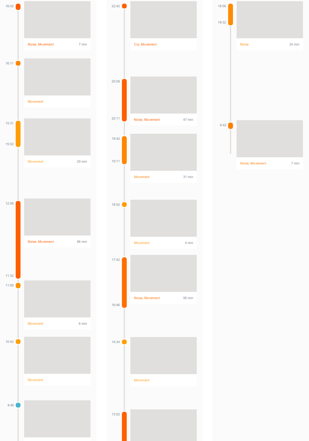
The timelapse would be accessible as a Replay screen including a day by day navigation:
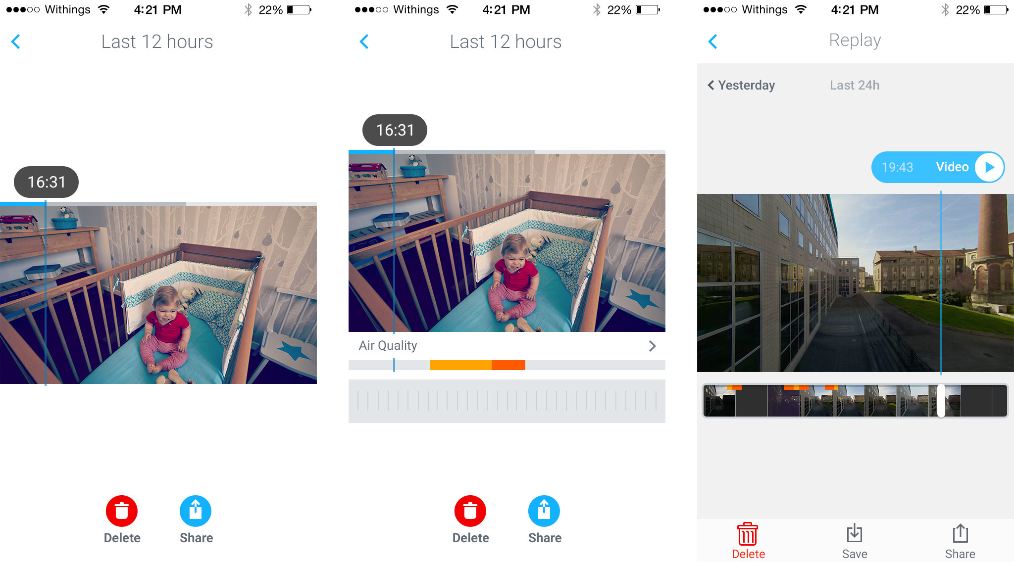
This video shows samples of the landscape view, both in autoplay and with interaction:
Giving access to hours of video recordings
Cloud Video Recording plans offer our users between 7 and 30 days of full video recording. That means possibly 720 hours of videos. The major limit is the ability to browse through the videos, discover the events, and be able to access it.
The timelapse and the Journal view provides the perfect entry points for full video recordings, acting as an index. The Journal view highlights moments of activity in the day, the timelapse provide an access to the whole day with a granularity of 5 minutes.
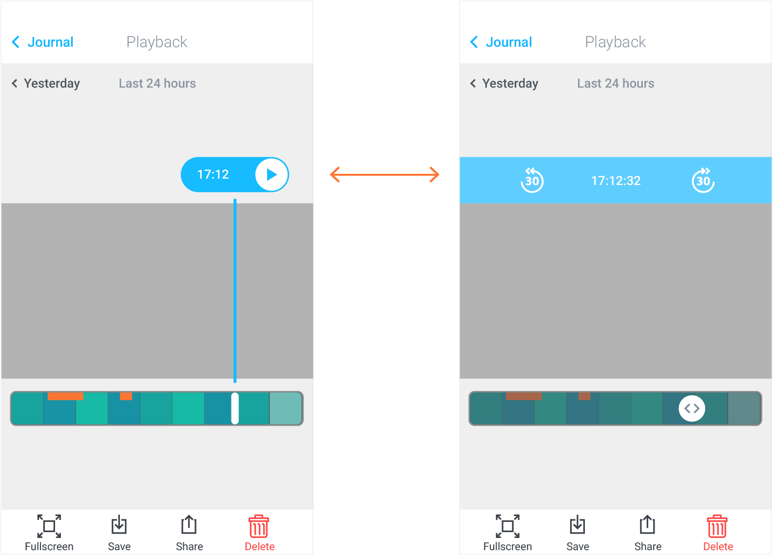
Clicking play switches the view to video mode at the selected point in time; the user can then browse through time by 30 seconds hops or go back to timelapse mode using the controller. Results in landscape and portrait:
Live video and interactions
Last piece of the puzzle: give access to the camera's Live Stream and real time interactions!
The Baby Monitor's heritage
The technology behind the Withings Home is a complete change from the Baby Monitor, and the Home app is very different from the Baby Monitor's companion app. Yet, it provided great insights on features like Live streaming, Push to Talk, Lullabies and Babyphone mode.
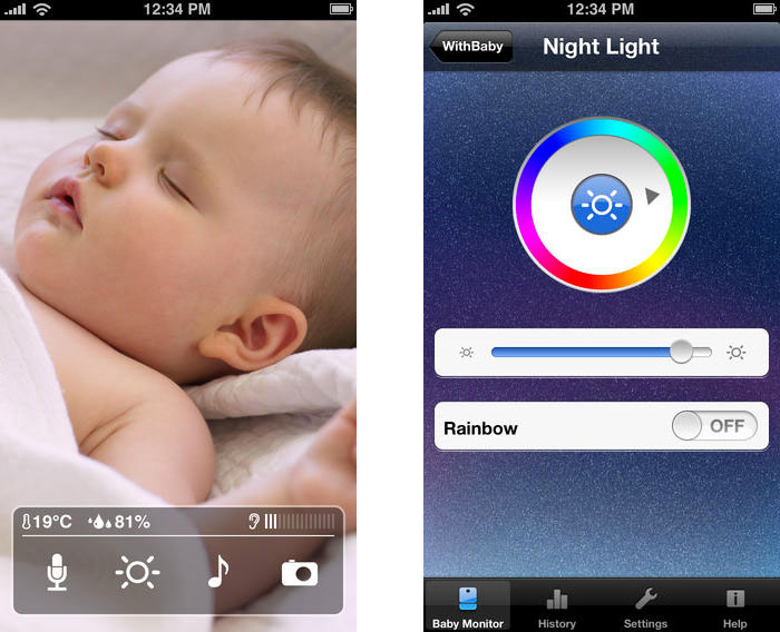
The first step was to evaluate the interface of the current Baby Monitor app in three ways: asking existing users what they liked about the app, checking the Amazon reviews and testing the interface on new users (in this case, new colleagues).
Users loved the feature offered by the app, but usability problems were visible:
- Lots of users failed to understand the Press and Hold interaction of the Push to Talk feature (mistaking the icon for Mute, nothing to help in case of error)
- Settings screens for light animations and music were on a far away screen making it inaccessible
- The Babyphone mode modalities were misunderstood and how to Start or Stop them was unclear
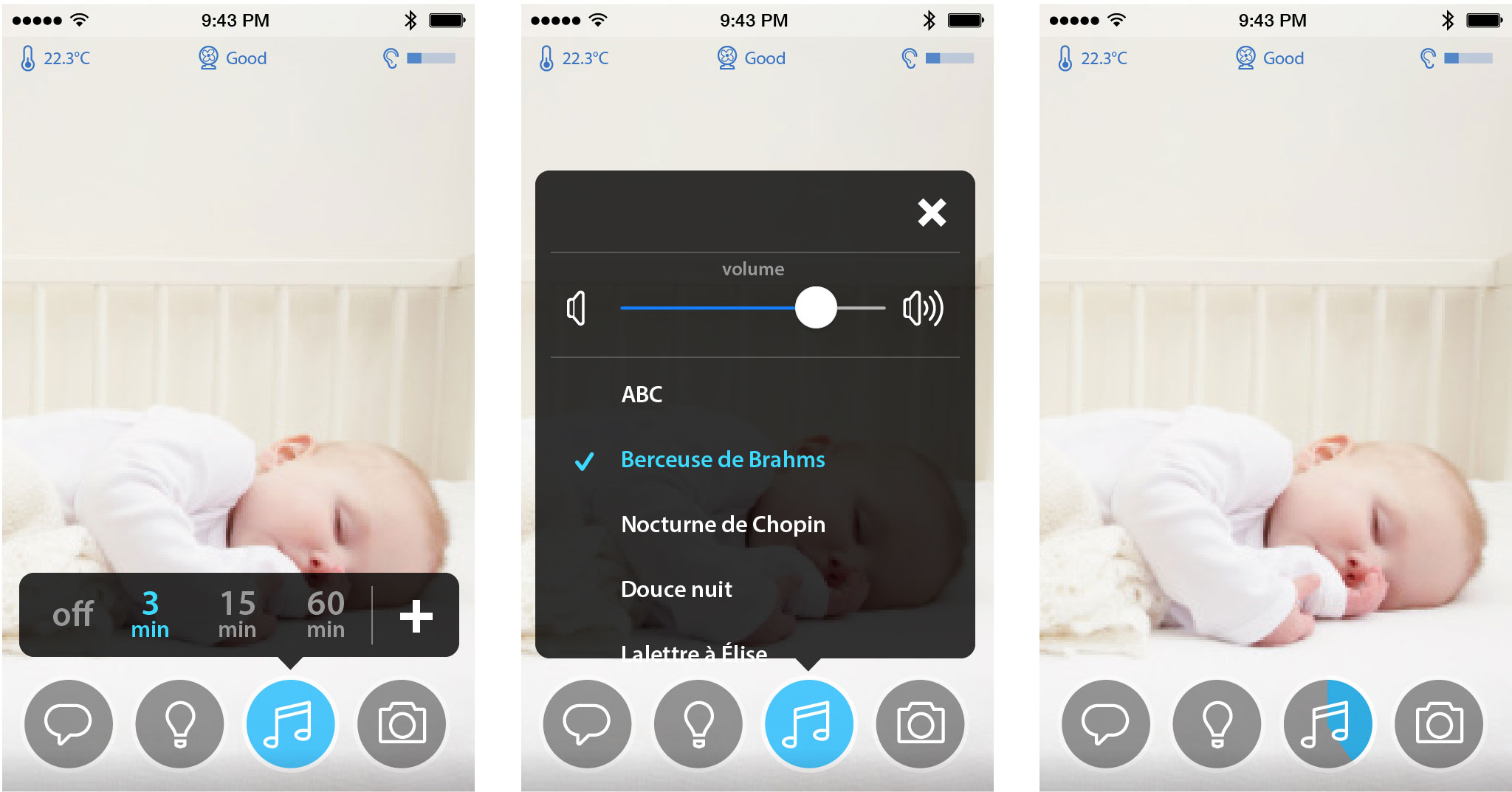
Polishing micro-interactions
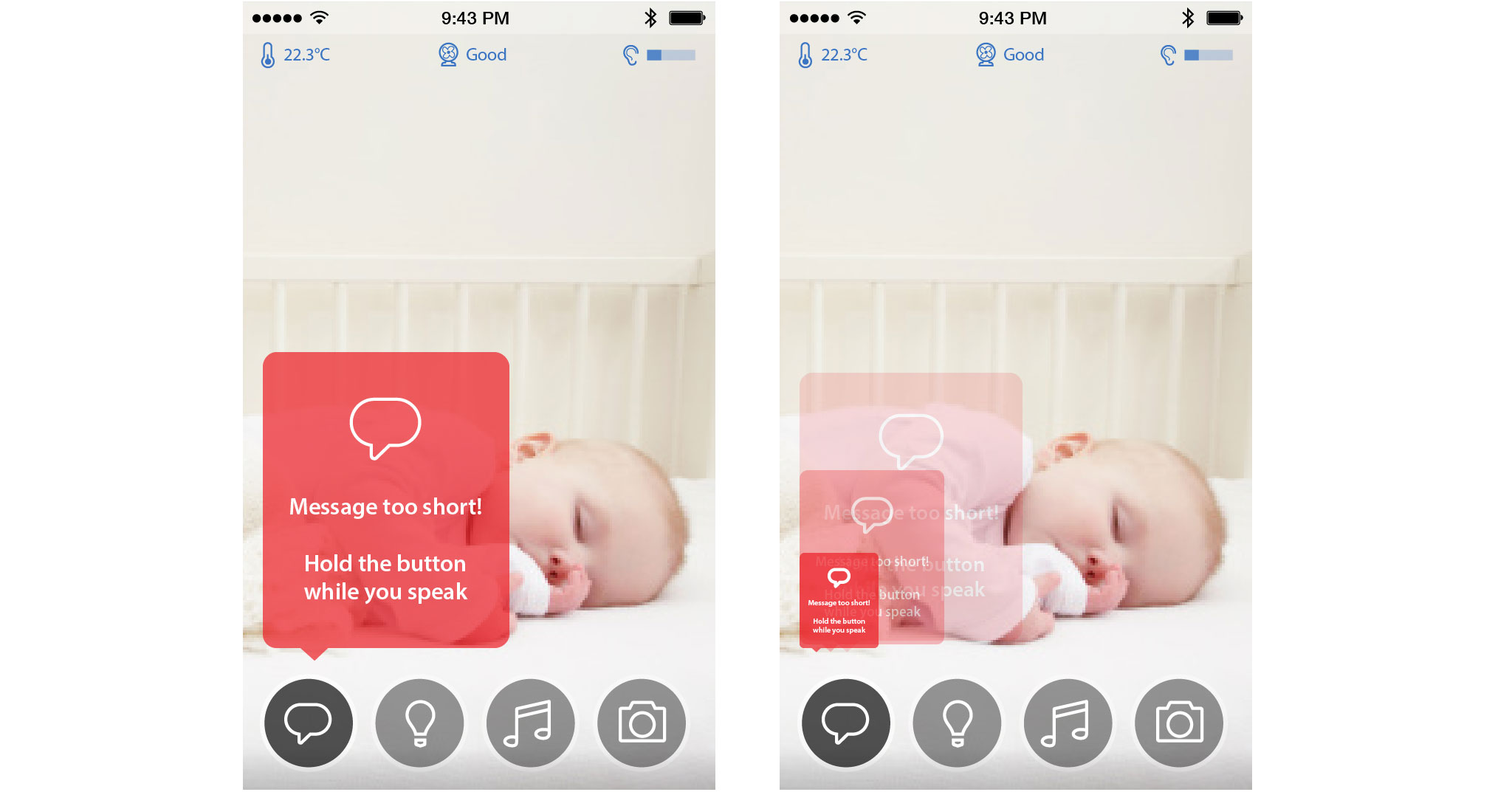
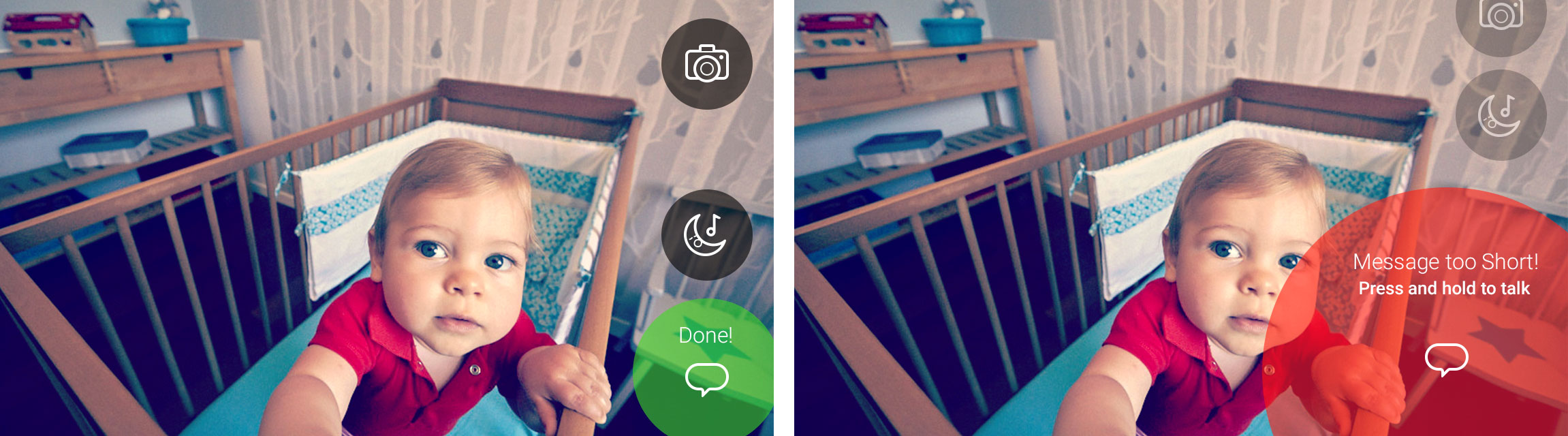
For the Push to Talk, I chose to stick with the existing Press and Hold interaction, despite being difficult to understand, for users loved its efficiency once they got the hang of it.
I started looking at ways to indicate, through animations and good errors handling, how the feature should be used:
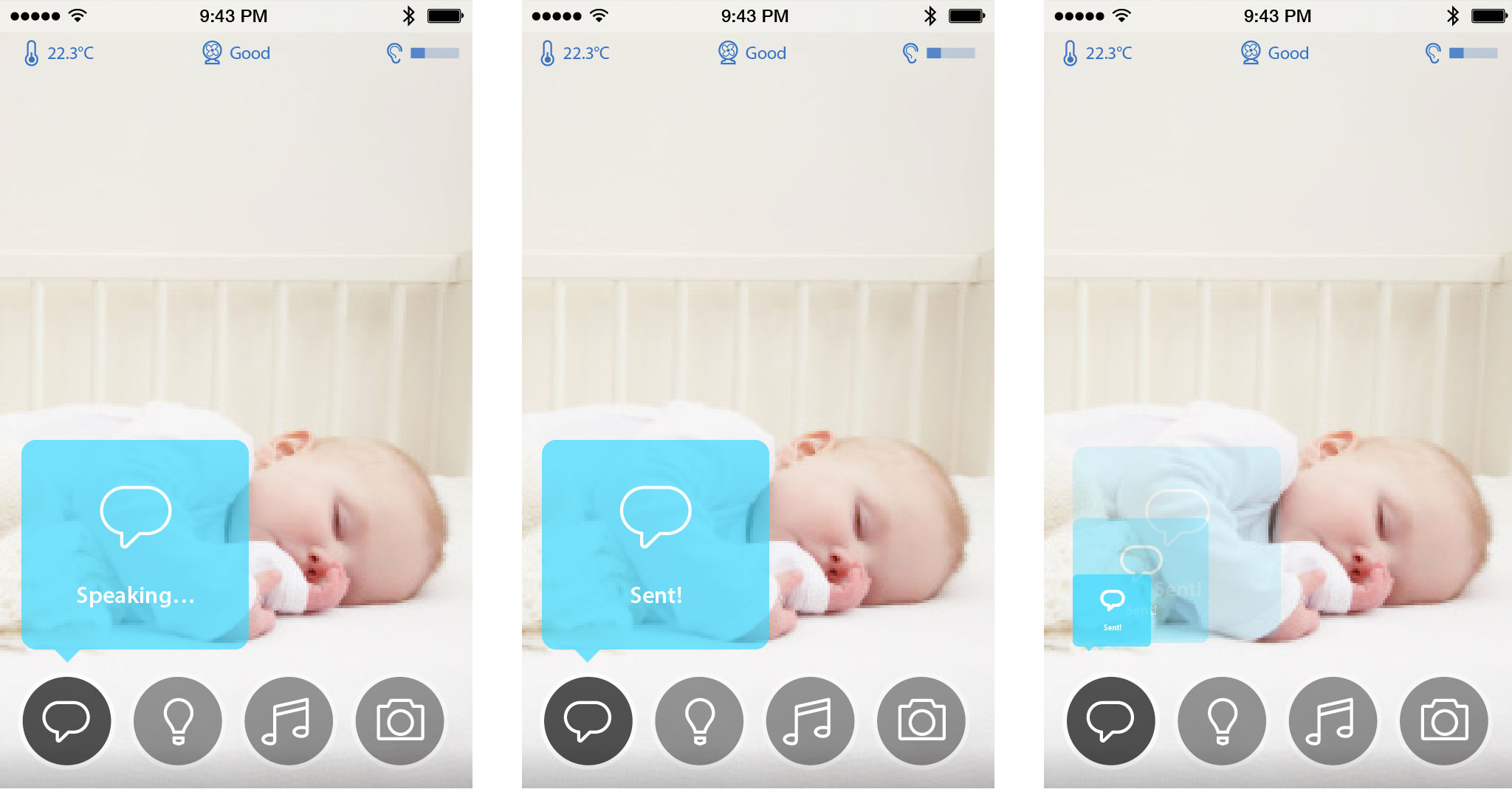
Most commonly, users would Click instead of a Press and Hold; it was easy to use that failed interaction to provide cues on the proper use of the button:
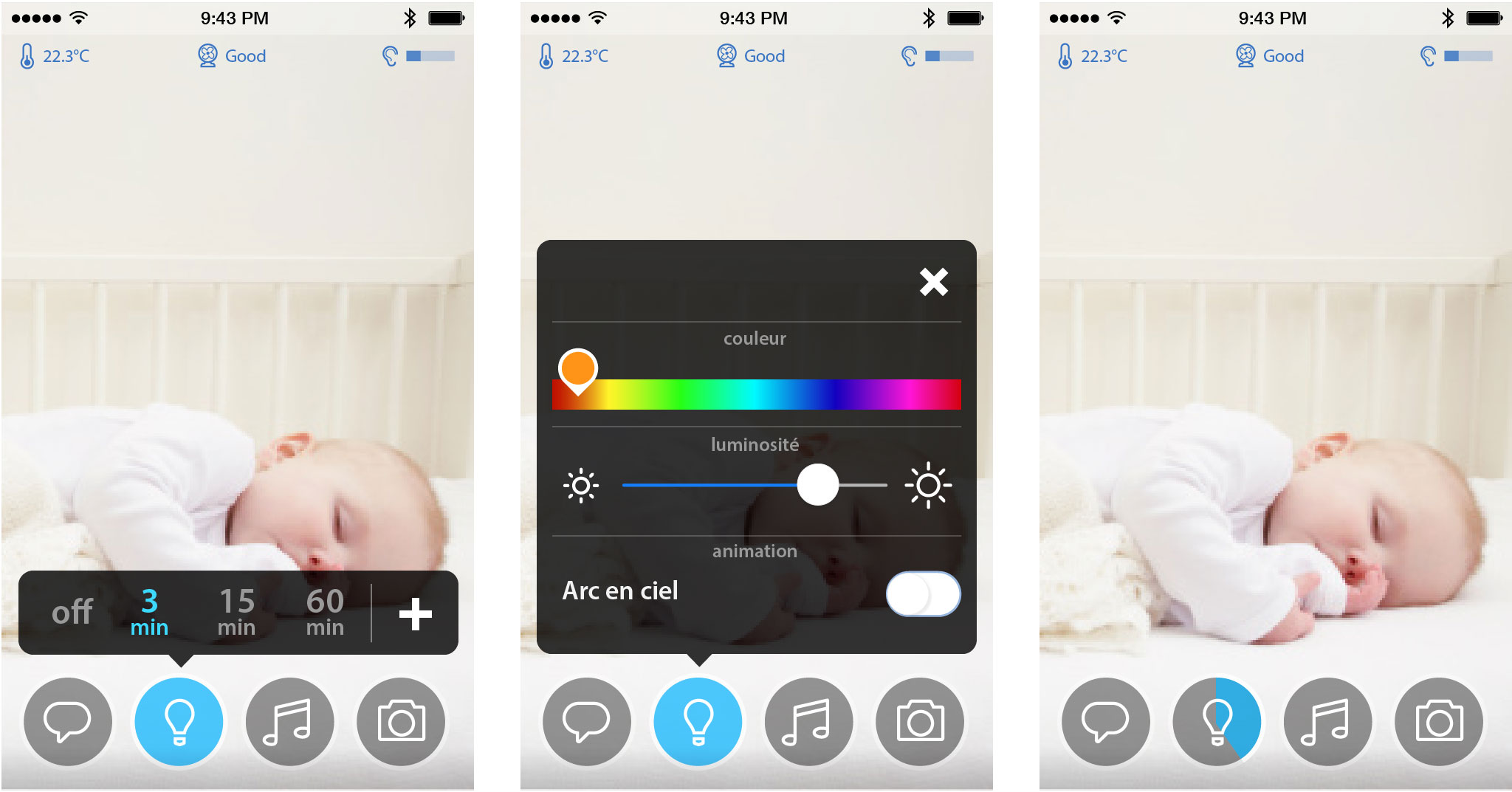
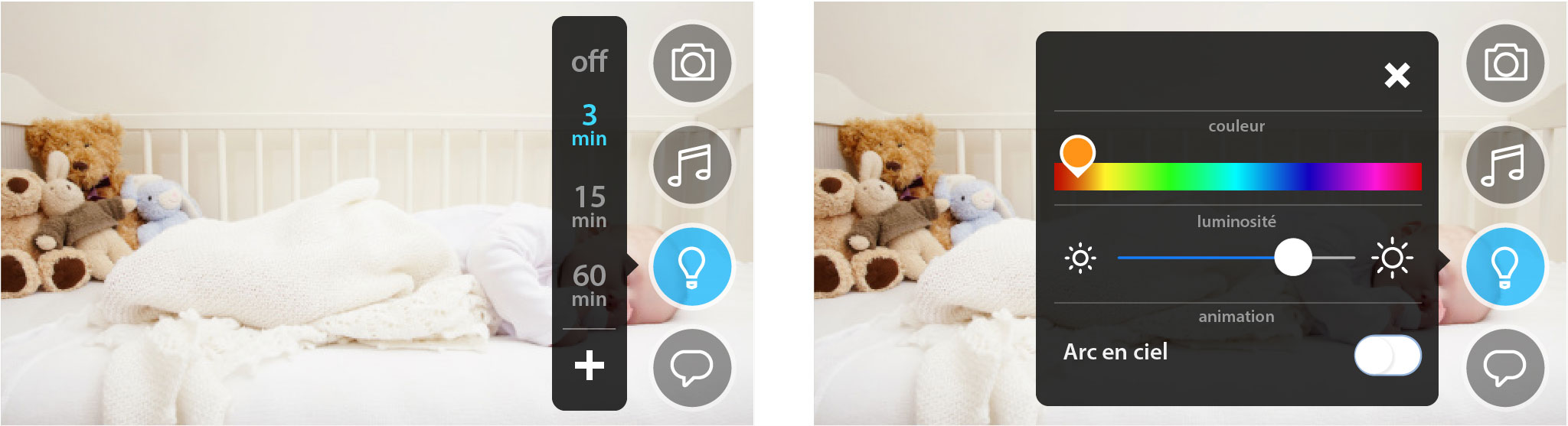
For Music and Light, I first focused on making settings accessible directly from the main screen:
To test the ideas depicted in the wireframe, I started by building a simple HTML prototype:
Testing that prototype with a few users gave quick results; not very fun, people would mostly use it as a pop up menu, and not understand the toggle button.
Also, Music and Light had the same purpose: help baby fall asleep. Both usually go by pair, so why not mixing them into one button, a Lullaby button.
Based on those feedbacks, I started working on visually advanced mockups and prototypes:
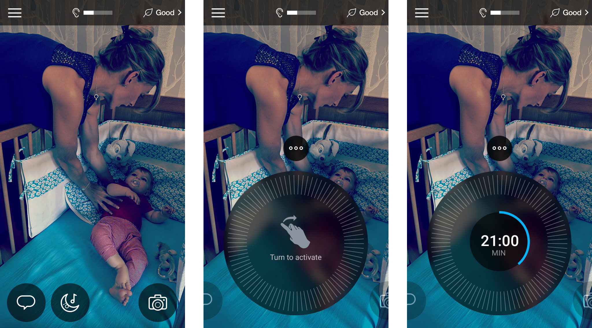
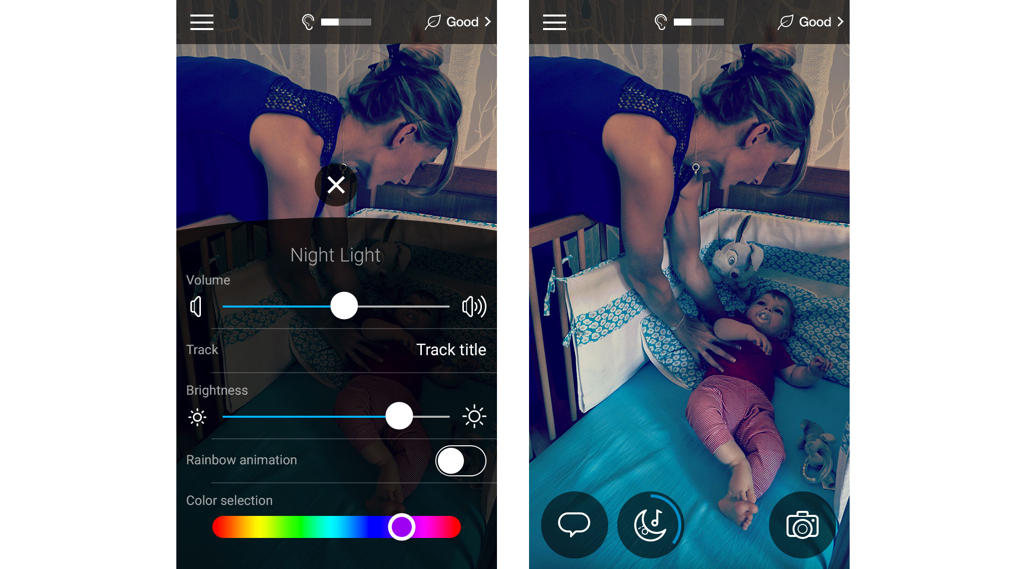
The new Push to talk screen is based on animations and colors that highlight the success of the interactions. The new Lullaby interaction is designed to convey the idea of time, to start, set and edit the duration of a Lullaby in one gesture and to give access to a full setting screen from the same screen.
In order to test those new interactions, I built a new prototype made in ActionScript3 (Flash):
Testing results were good and after a few tweaks, a version very similar to the prototype has been implemented:
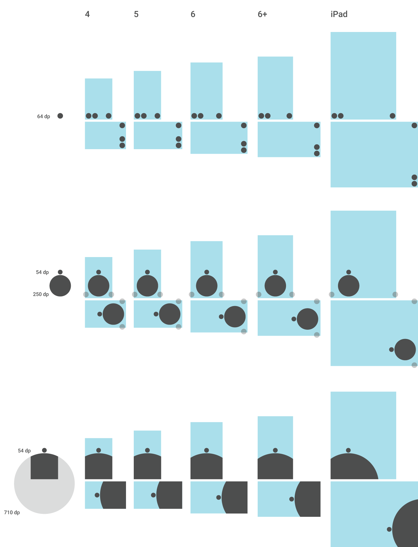
The UI would adapt to different screen sizes following those rules:
Some other interactions have been implemented as well, like automatic image improvement after a pinch and zoom on the video feed:
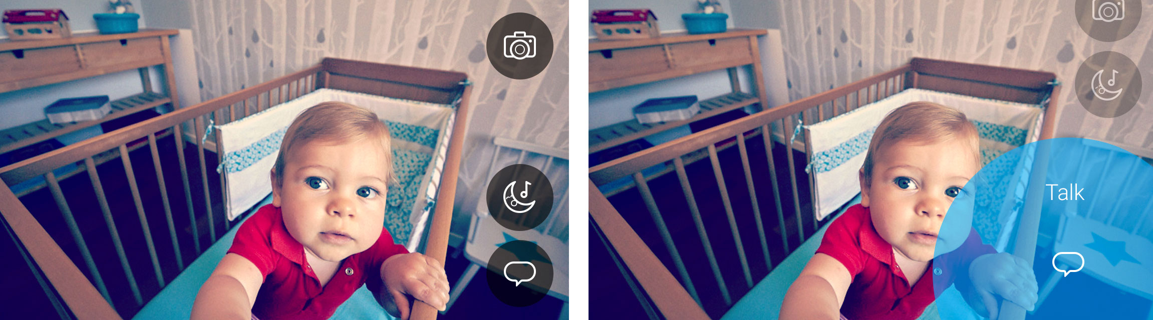
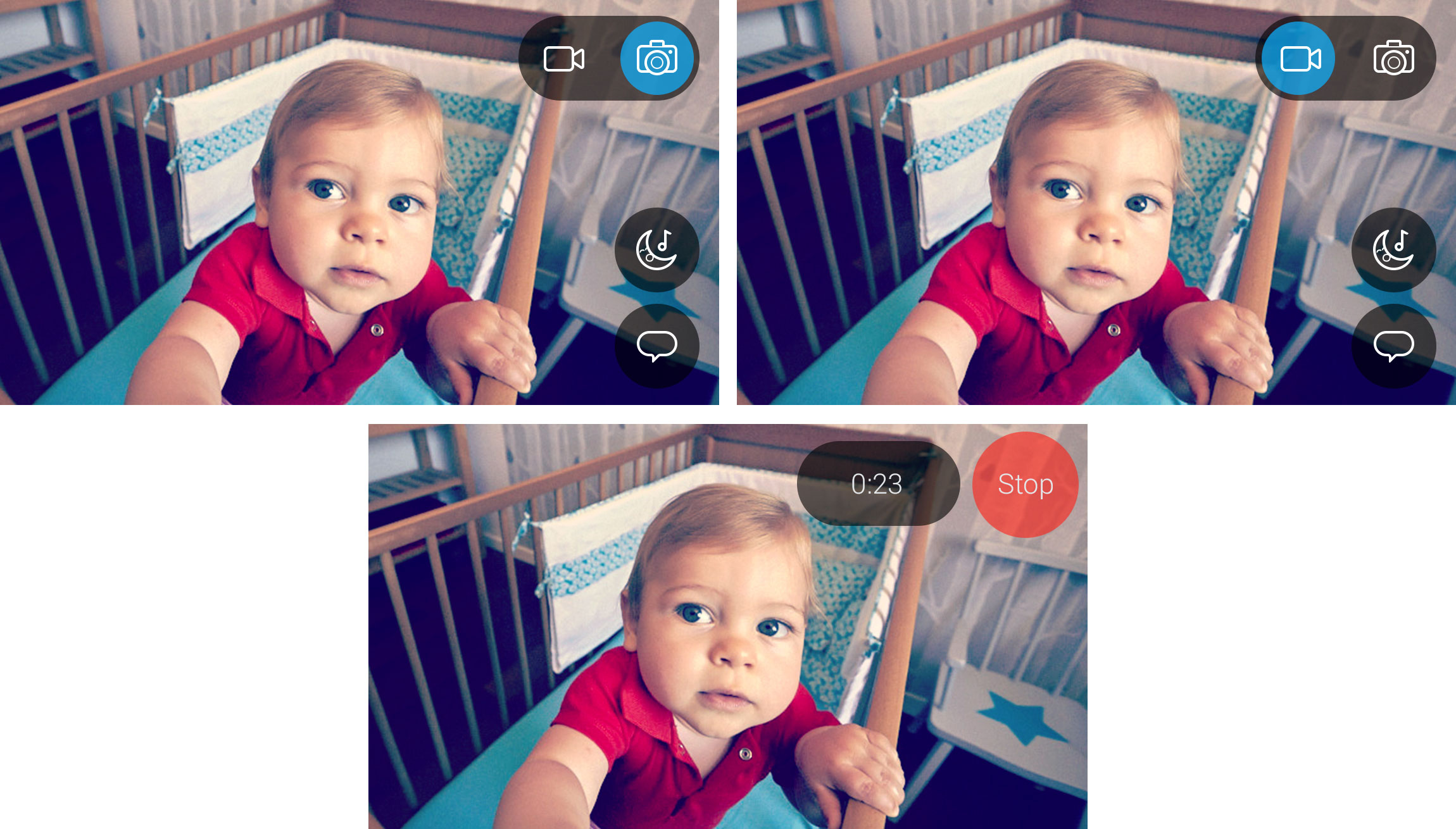
The last piece of live stream interaction is the on demand ability to take a picture or record a video from the live stream.
Snapshots are taken with a Press on the camera button, Video recording are accessible through Press, hold and release on the video camera button:
Bringing the pieces together
Following those experiments, the work began on the structure of the application. At this point, the first working prototypes had arrived, and we could start dog fooding our internal testers with the first versions of the app and getting a large quantity of feedbacks.
Navigation between the major screens
We needed a pivotal screen to articulate the Live, Journal and Replay views, all associated to core needs (see and react to what is happening now, see what happened recently, see what happened over the course of the last few days).
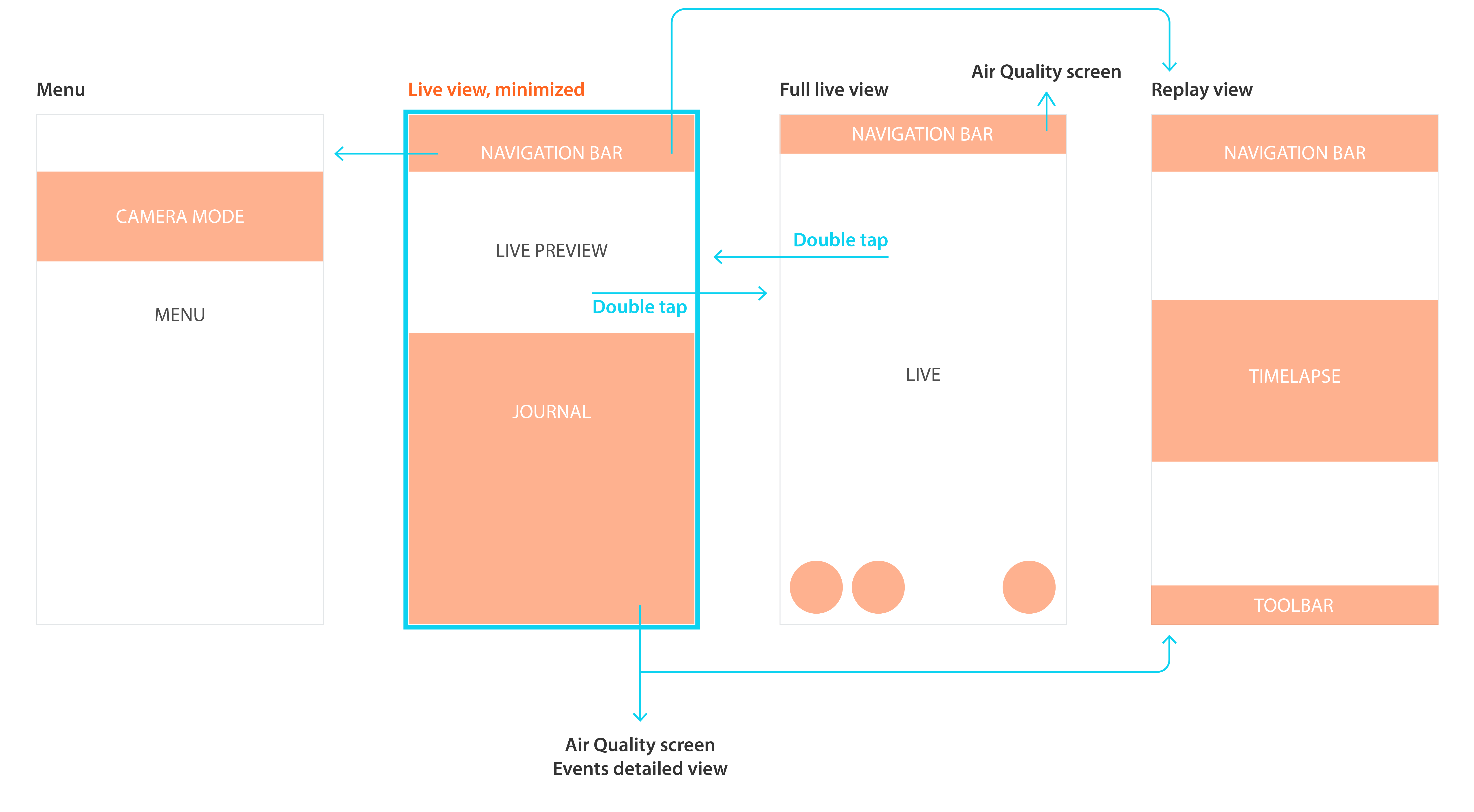
Under the Navigation bar, the landing screen is chronologically organized, with a short view of the Live Stream (now) and the beginning of the Journal (the past).
The Navigation bar gives access to a menu and the Replay screen. A Double tap on the short Live Stream will open the Live full screen, and the same action will take the user back to the original state.
Also, the Journal was acting as HUB for the different screens, providing access (through the items) to the past days of the Replay screen (through day summary items), the Air Quality screen and the Alerts detailed view (through the Alerts items).
To smoothen the interactions, a few gestures were added:
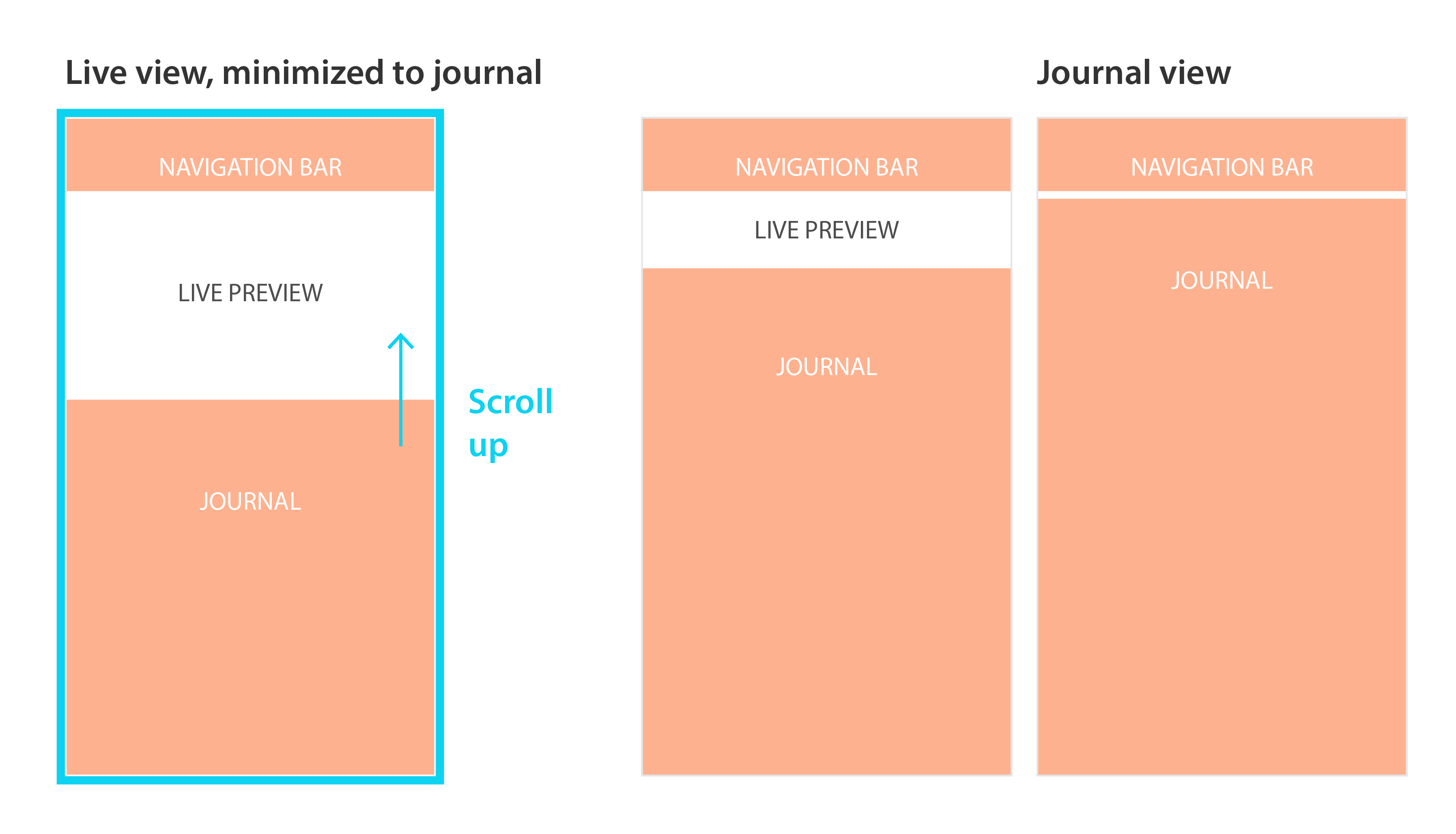
Scrolling up the Journal would hide the short Live Stream view.
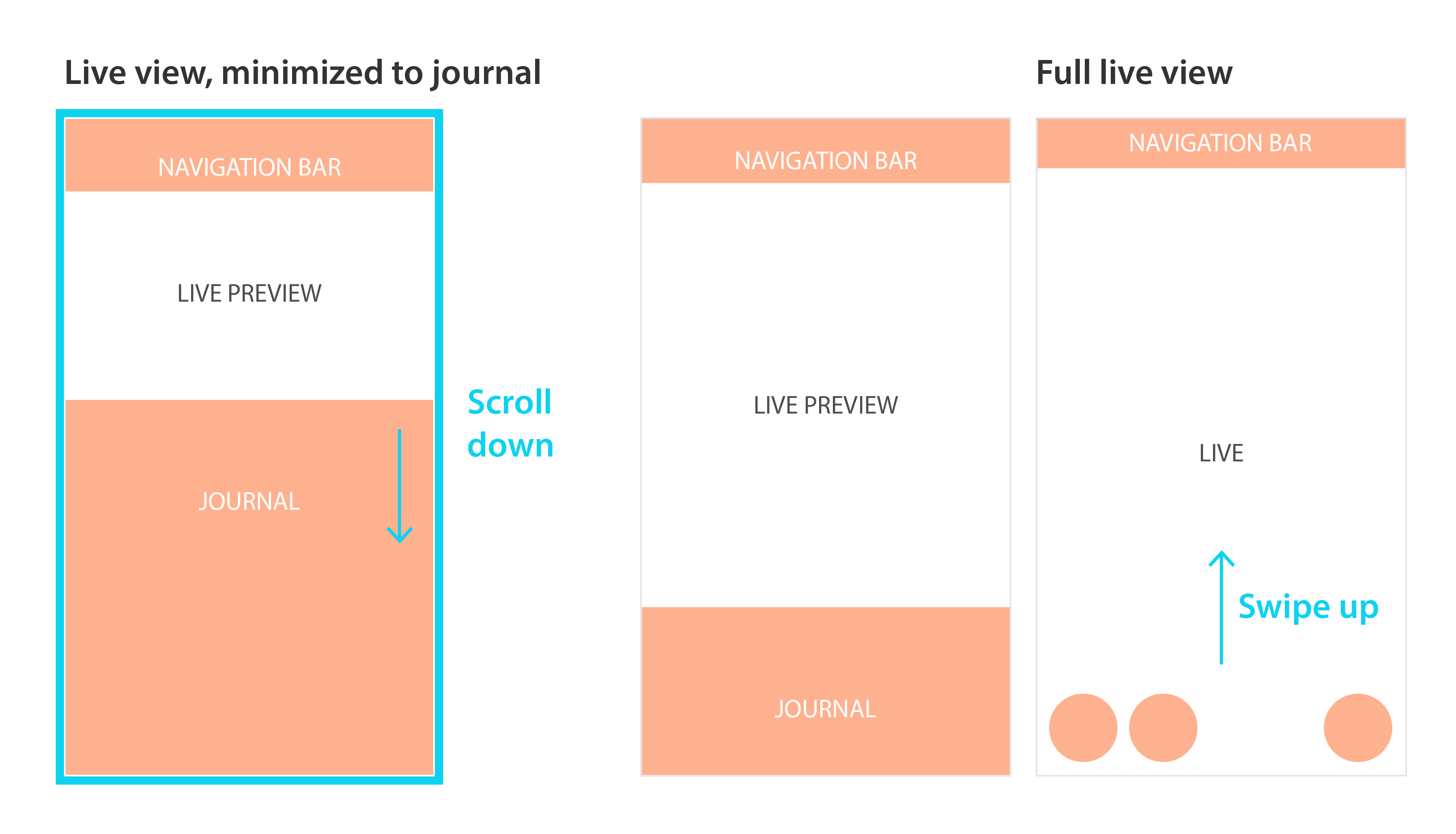
Scrolling down the Journal would transition to the Live full screen view, which was working great as a discovery tool for the screen. Yet, users would find themselves trapped, not knowing about the Double tap gesture to switch back.
We added a Swipe up gesture that solved the problem.
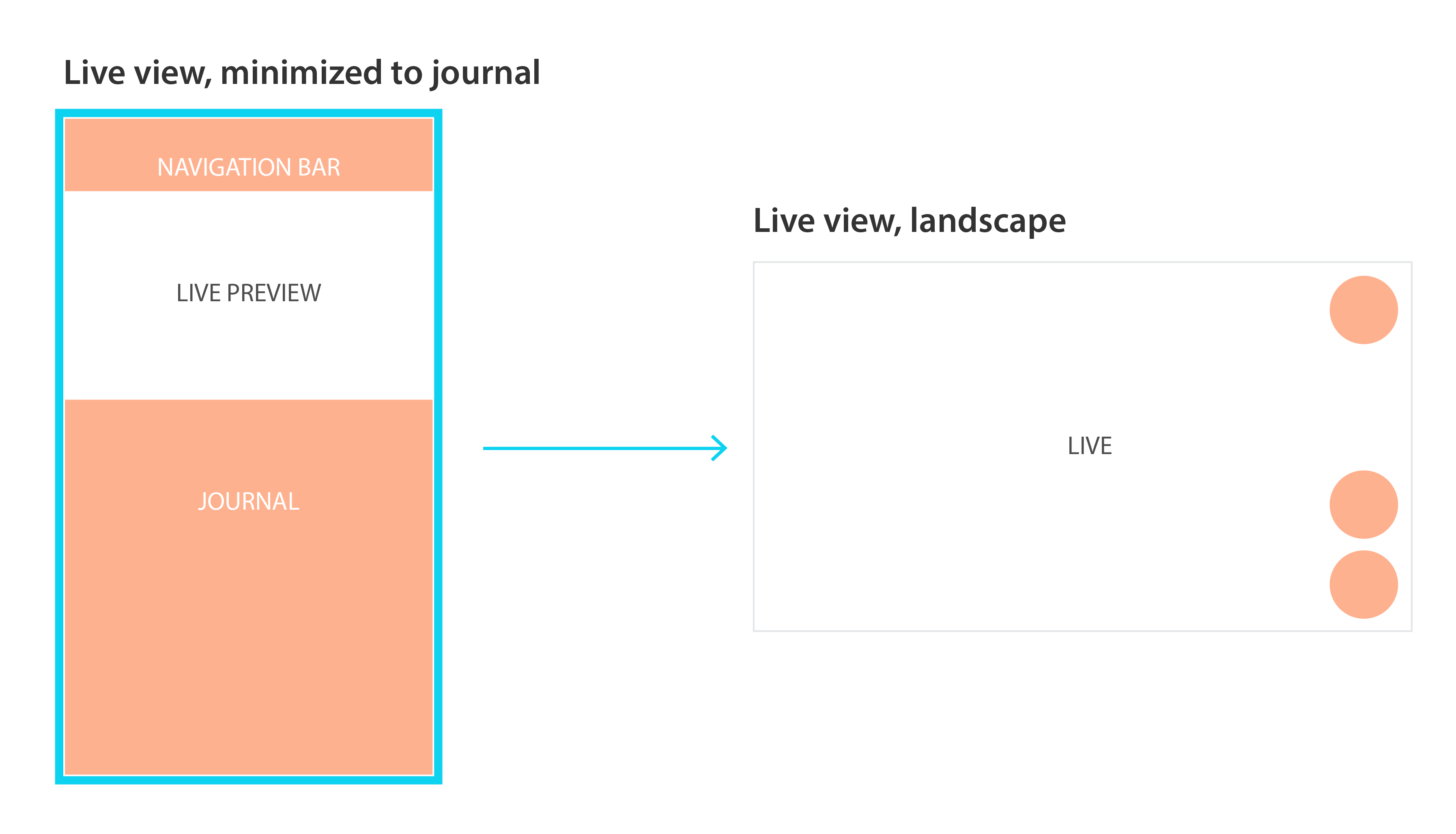
Also, going from Portrait to Landscape would switch the view directly to a Live full screen landscape mode:
Adding a Swipe up gesture solved the problem.
A quick look at the app today
Final words
After a long time bringing evolutions to existing apps (changing the wheels while the engine is running), working on a new product felt refreshing. It was also very interesting to work at different scales of the project, from high level ideas to UI details, with the embedded software team, the platform team and the mobile apps team.
The ideas and UI were constantly updated using the feedbacks given by the team members on the prototypes at first, internal testers on the working prototypes and alpha of the app, and by our early adopters after the launch.
Also worth mentioning, the Withings Home has a nice Apple Watch app (see the gallery in my portfolio here) available since April 22nd. The product is still under active development.